HA-05
2025–26
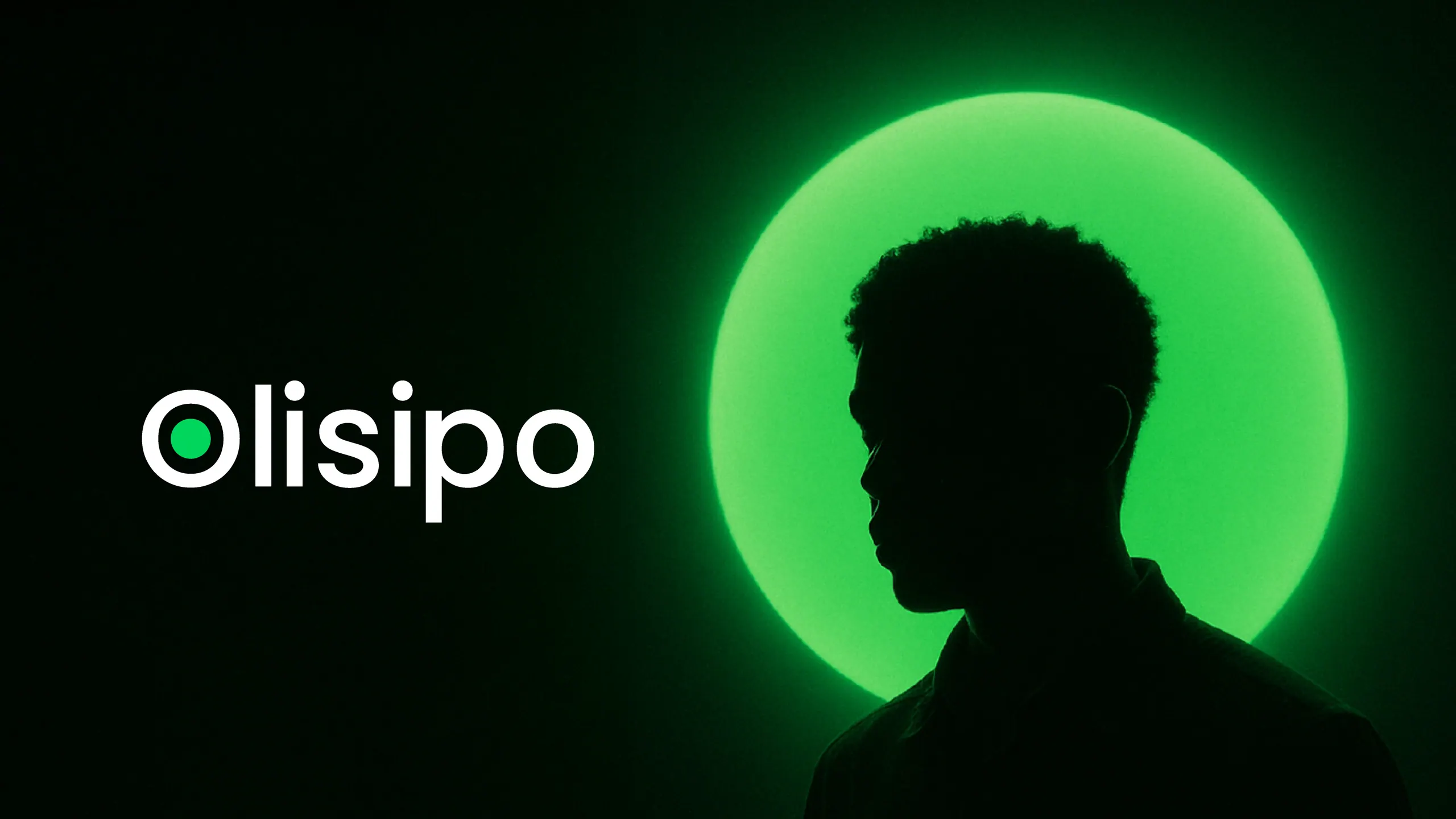
Rebrand · Brand System · Campaigns · Social · Motion
Fig. HA-05.01 · The Mark and the Ring
Helping a company with 30+ years in IT talent grow from playful to calm and premium, together with both the Brand Manager and the Marketing Director.
01. Context
Olisipo has spent more than 30 years finding, placing and training people in IT. I joined its marketing team in May 2025 as a graphic designer.
The brand back then was friendly and a little playful, the “funny geek” voice. The company had grown past it: it was talking to more serious clients and to people making big career decisions, and the identity needed to feel as trustworthy as the work behind it, without losing the closeness.
02. The Idea
You, Inside the Circle.
A dot is where every drawing starts. In the new mark it sits at the centre of the “O” and stands for one person: you, inside the Olisipo community. Everything else grew from that: a ring of mint light around a figure, a calm dark ground, and the line Our Talent. Your Future.
03. My Role
The rebrand was built as a team. I developed it with Olisipo’s Brand Manager and with the Marketing Director. My part was the visual side: the logo system, colour, type, imagery and the Brand Book. Since then I design with it every day, across social, campaigns and motion.
- Developed With
- Brand Manager, Olisipo
- Developed With
- Marketing Director, Olisipo
04. The System
04.a Identity
- 1In geometry a dot is the starting point of everything. In the logo it stands for knowledge, growth and potential, and for “you”, the person at the heart of the O.
- 2The “O” measures the whole system: the logo is 4.64 “O”s wide, the same unit sets the clear space, and the green dot is twice the size of the dot on the “i”.
- Olisipo Obsidian#0C0F0DRGB 12 · 15 · 13Pantone Black 3 CDark grounds and materials
- White#FFFFFFRGB 255 · 255 · 255Text on dark, paper
- Olisipo Mint#00D65BRGB 0 · 214 · 91Pantone 7480 CThe accent: dot, highlights, buttons
- Olisipo Mist#E9EDE8RGB 233 · 237 · 232Pantone P 134-9 CLight grounds
- 1Bright green is an unusual pick for a premium brand, which is why we kept it: fresh and clean, like a breath of air. It works because it stays small: dark grounds first, white for text, and Mint for about a tenth of a layout.
- 2Obsidian is a soft black and Mist a white with a hint of green, so the palette never feels cold.
Our Talent. Your Future.
- Light Italic
- Regular
- Medium
- SemiBold
- Bold
- 1One typeface from the logo to the smallest line. Hierarchy comes from size, never from extra fonts: headlines are SemiBold in Title Case, and colour is the only accent inside them.
04.b The Brand in Use
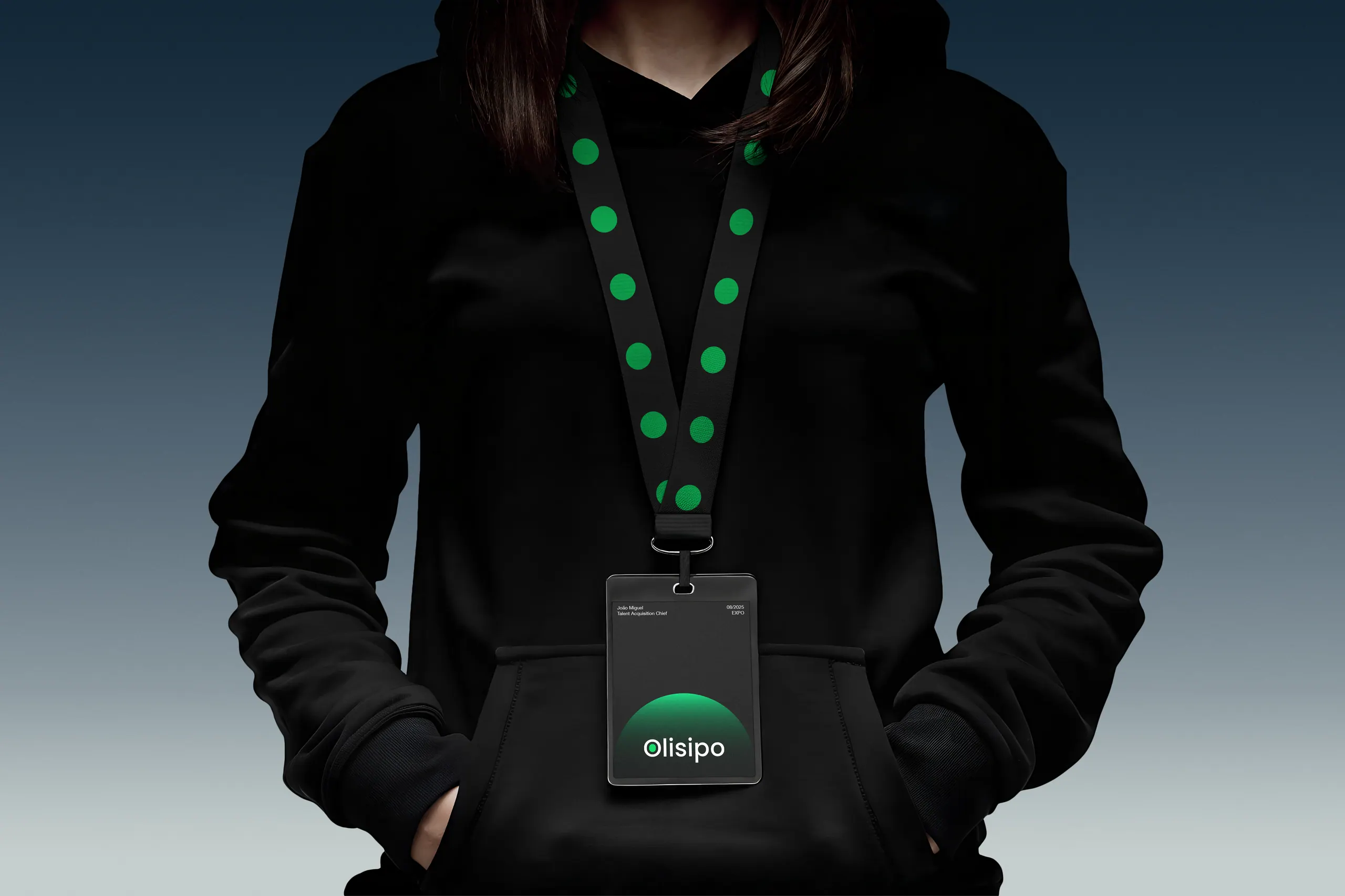
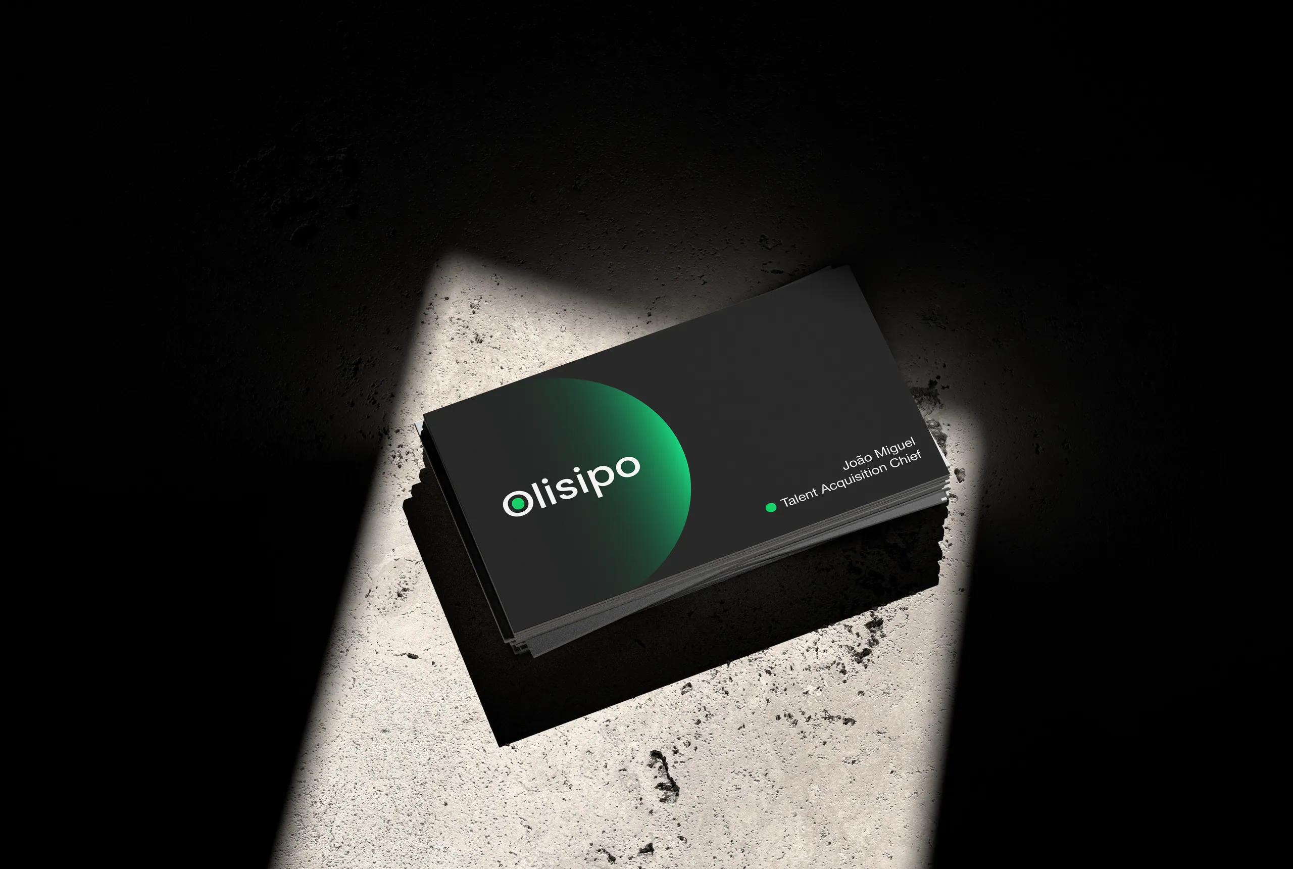
- 1Two concepts for carrying the system onto everyday objects: the dot on the lanyard, the logo alone on black.
04.c Side Exploration: The Moving Dot
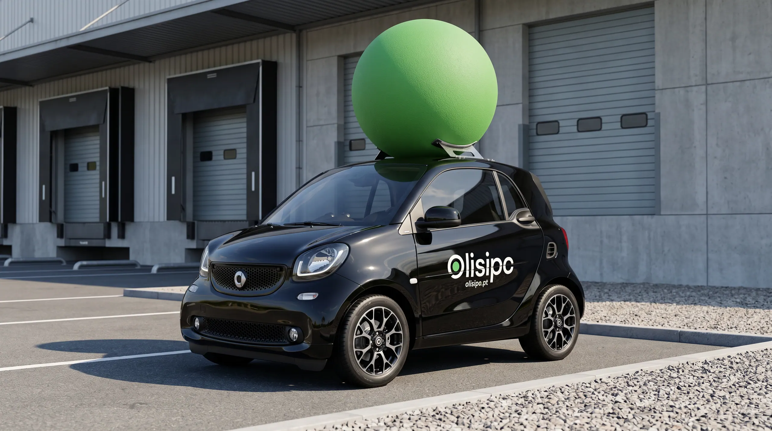
- 1A concept exploration I made on my own for guerrilla marketing: the dot leaves the logo and rides on the roof, a bit like a Red Bull car.
- 2It doesn’t fully fit Olisipo’s tone and language, which are calmer than this, and it was never adopted. I keep it because it showed how far the dot can travel.
04.d Campaigns
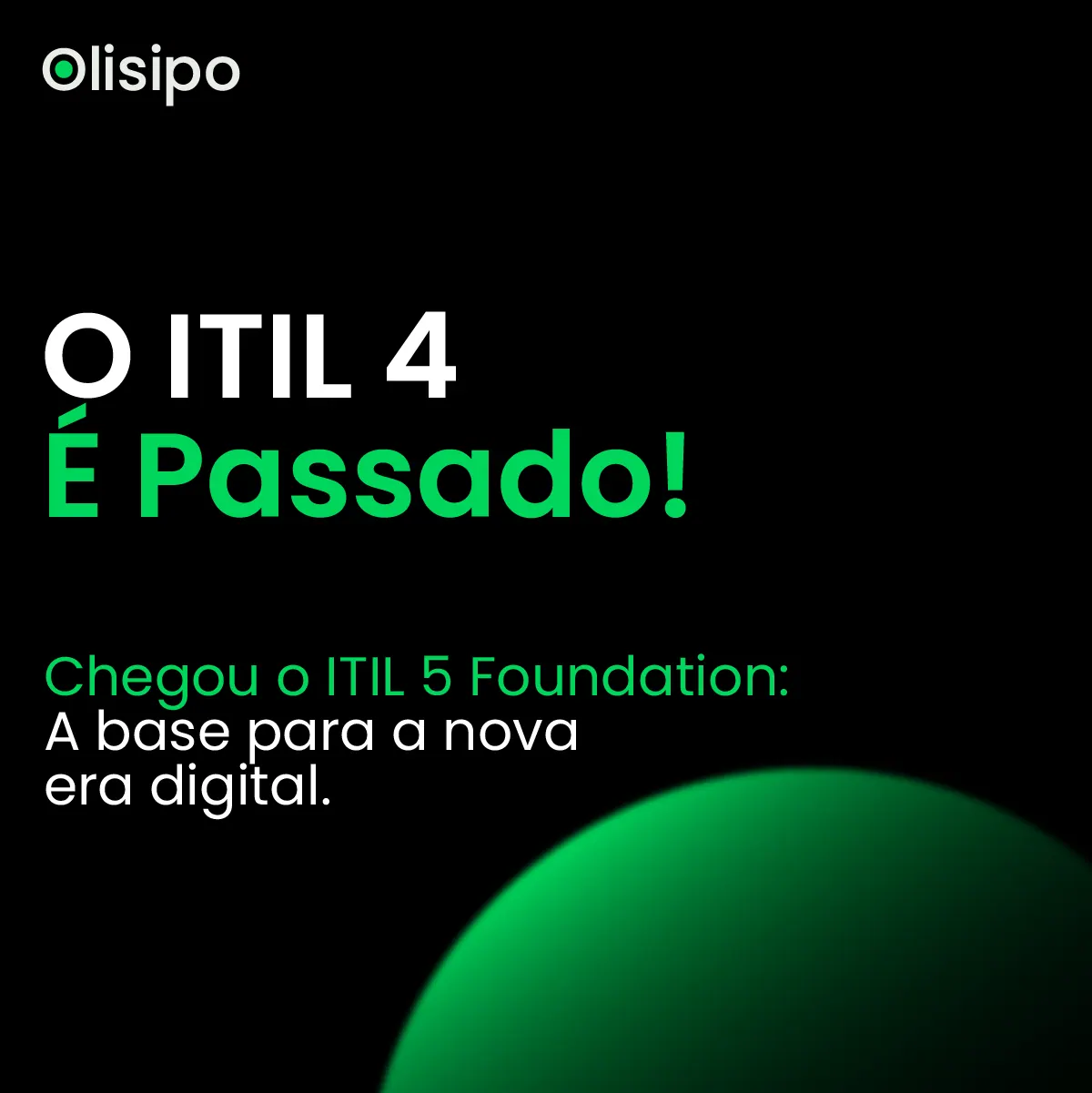

- 1Each campaign ships as a set: feed, story, banner and motion, from one layout.
- 1The course list as one continuous camera move: cards turn, overlap and settle, so a list of dates reads like a film.
04.e Every Week
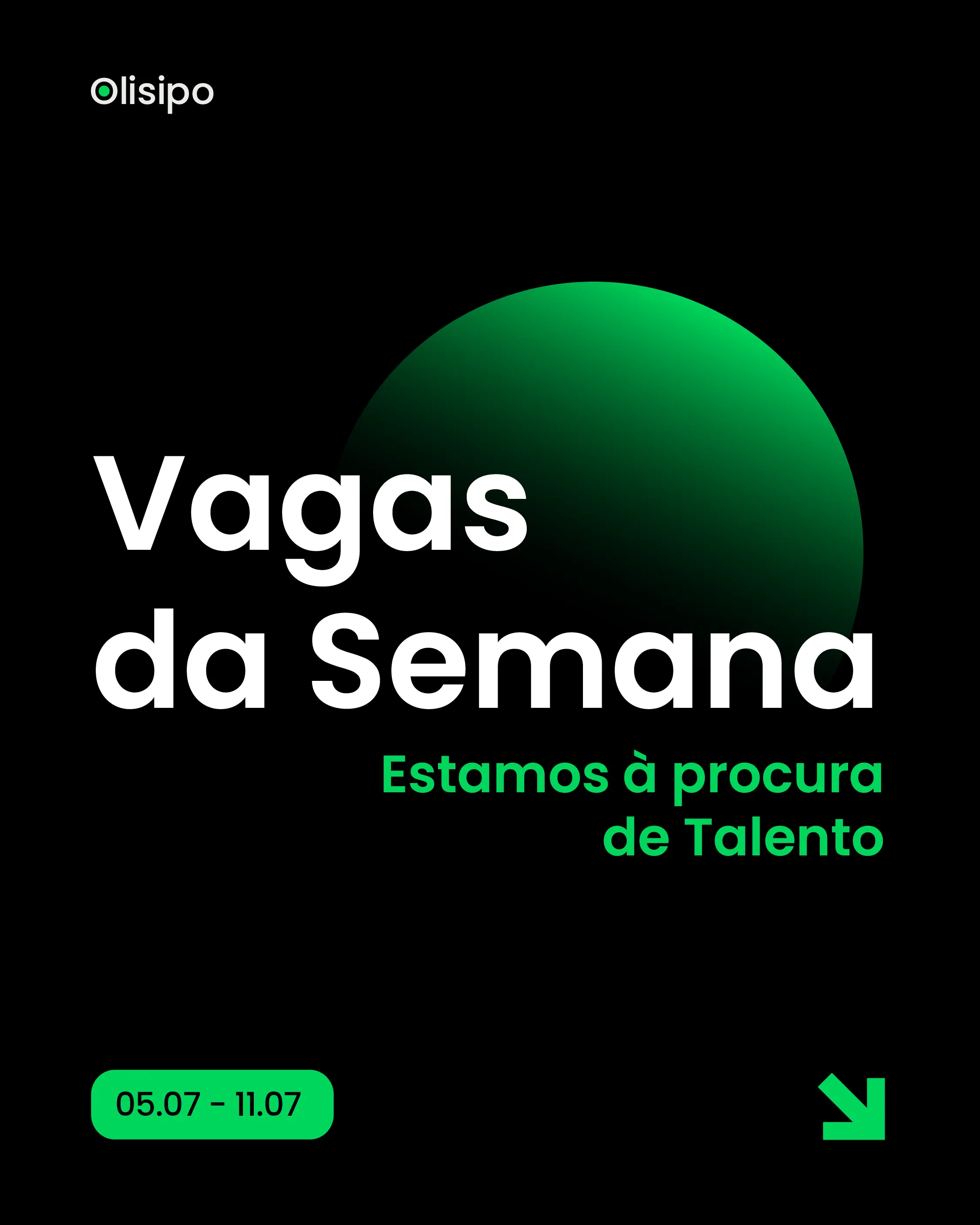
Fig. HA-05.12Vagas da Semana 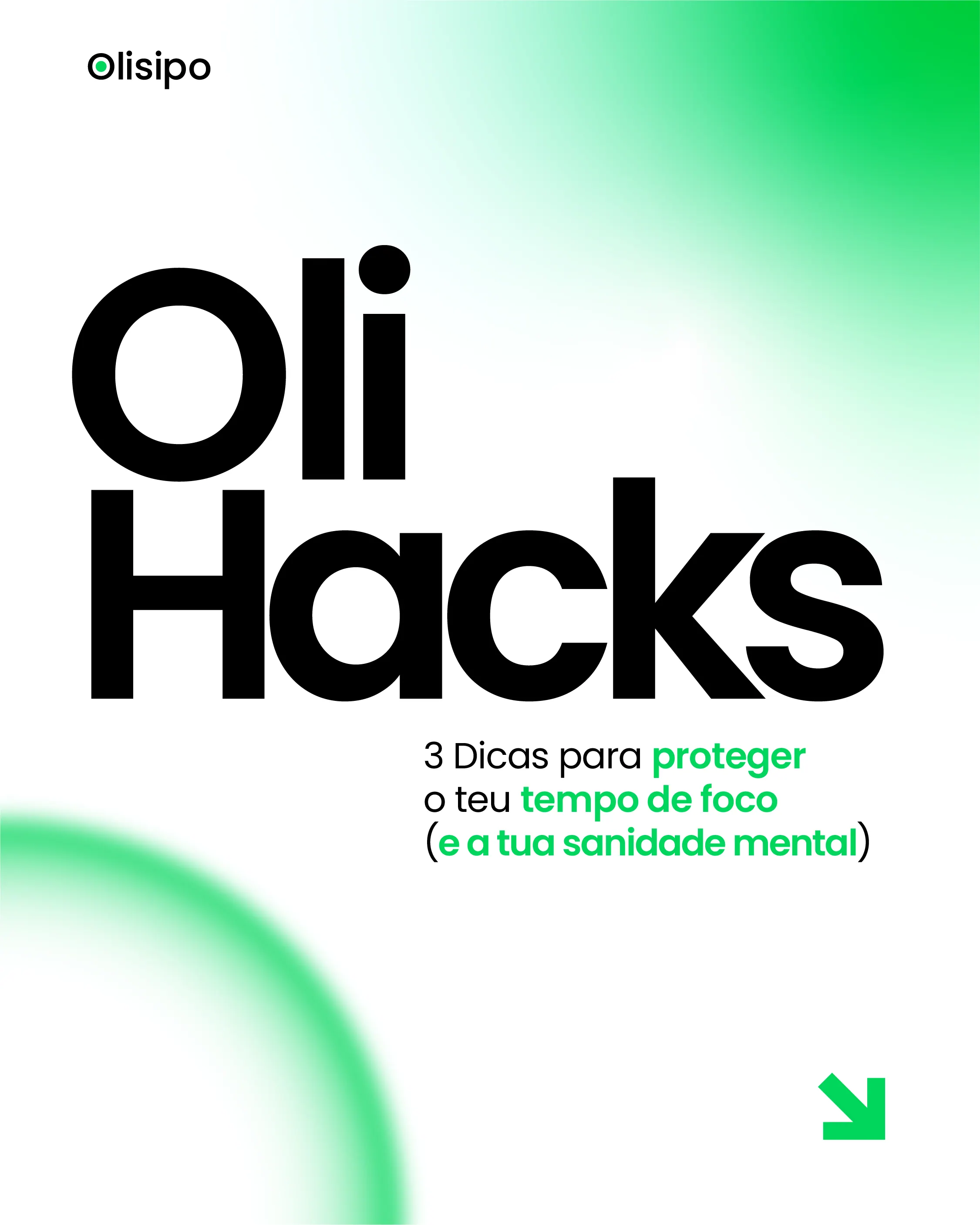
Fig. HA-05.13OliHacks 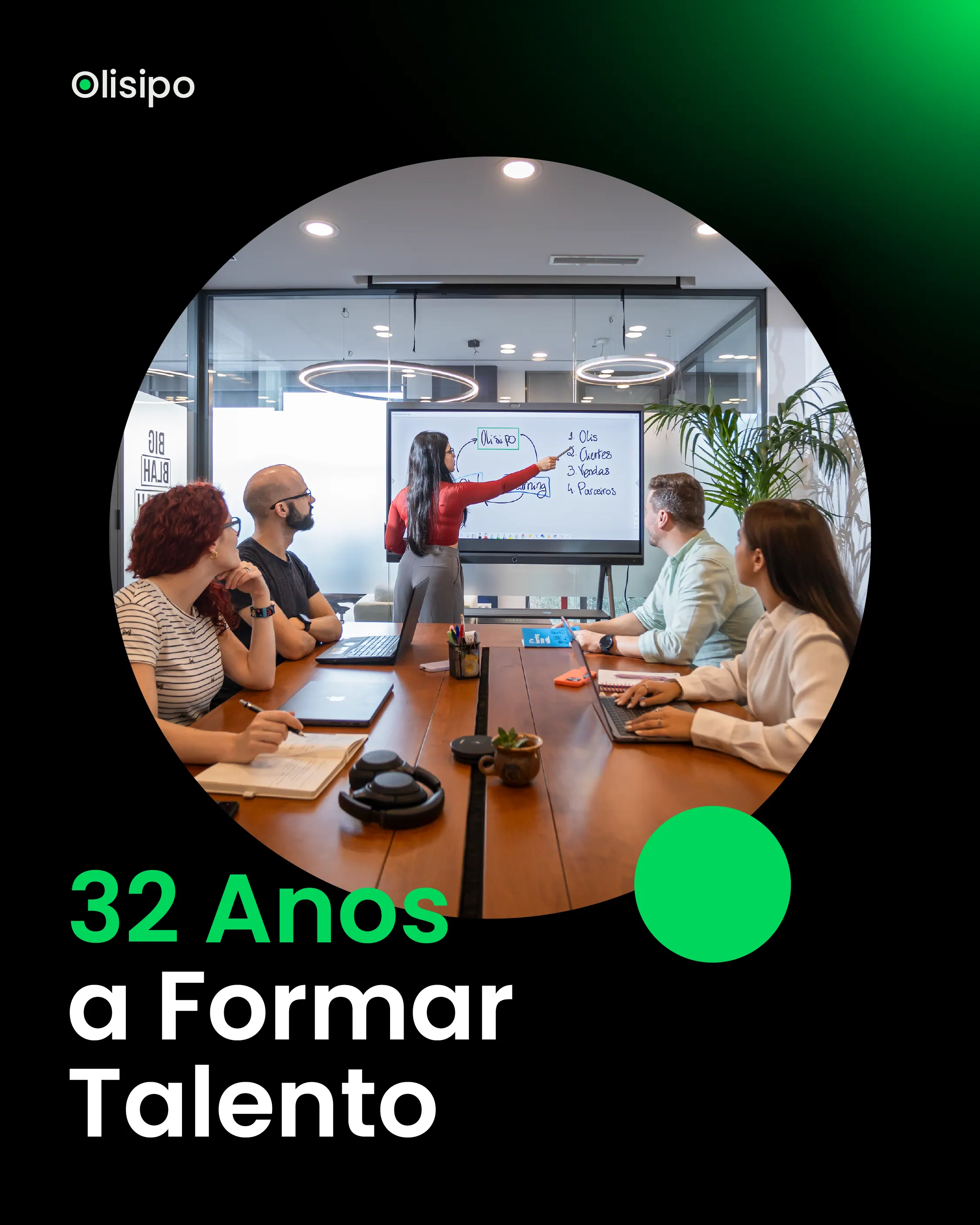
Fig. HA-05.14Porquê Olisipo? 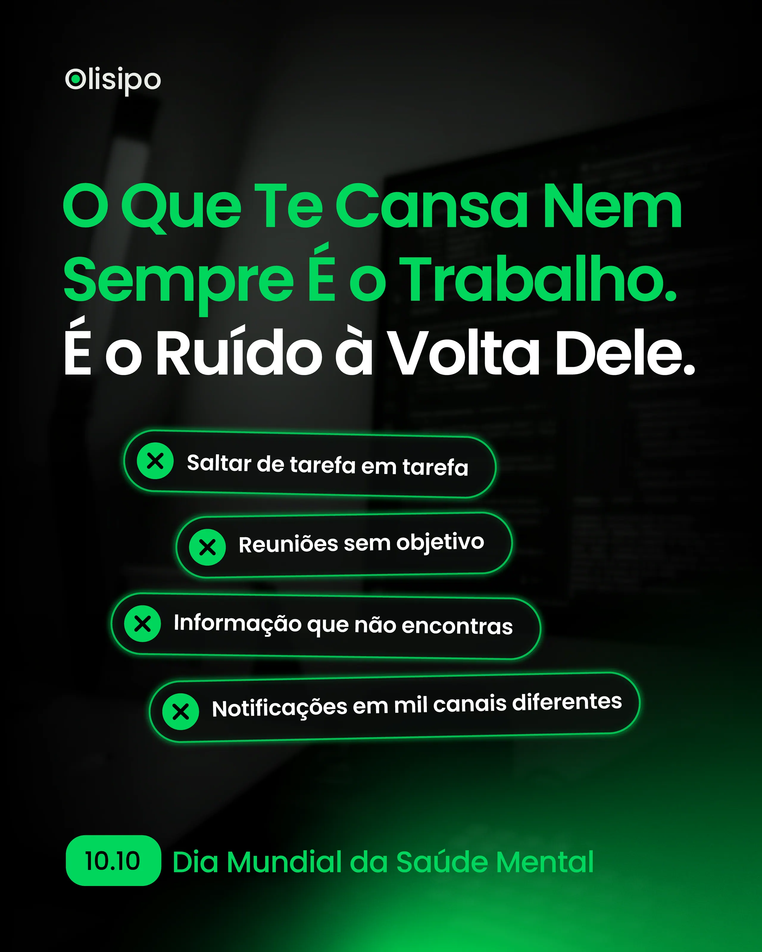
Fig. HA-05.15Saúde Mental no IT
Instagram & LinkedIn
05. Outcome
Olisipo started using the new identity in February 2026. It now carries the campaigns, the weekly social posts and the motion work, and we keep shaping it together as it meets new formats.
Contact
Not taking commissions at the moment. Open to talks, and to collaborations depending on the project.